Learn the 3 key sections every logo presentation needs: Strategic Foundation, Visual Identity, and Applications to get client approval faster.
The 3 Key Sections Every Logo Presentation Should Include
A professional logo presentation should include three key sections.
A Strategic Foundation,
A Visual Identity, and
Brand Applications
Together, these sections explain the thinking behind your logo.
It presents the identity clearly, and shows how it works in real-world situations.
A well-structured logo presentation gives clients the confidence to understand, and approve the final brand identity.
1. Strategic Foundation
The Strategic Foundation section comes before any logo is revealed. Its job is to show the client that the design decisions ahead of them are grounded in their brand, not arbitrary creative choices.
Pages to include:
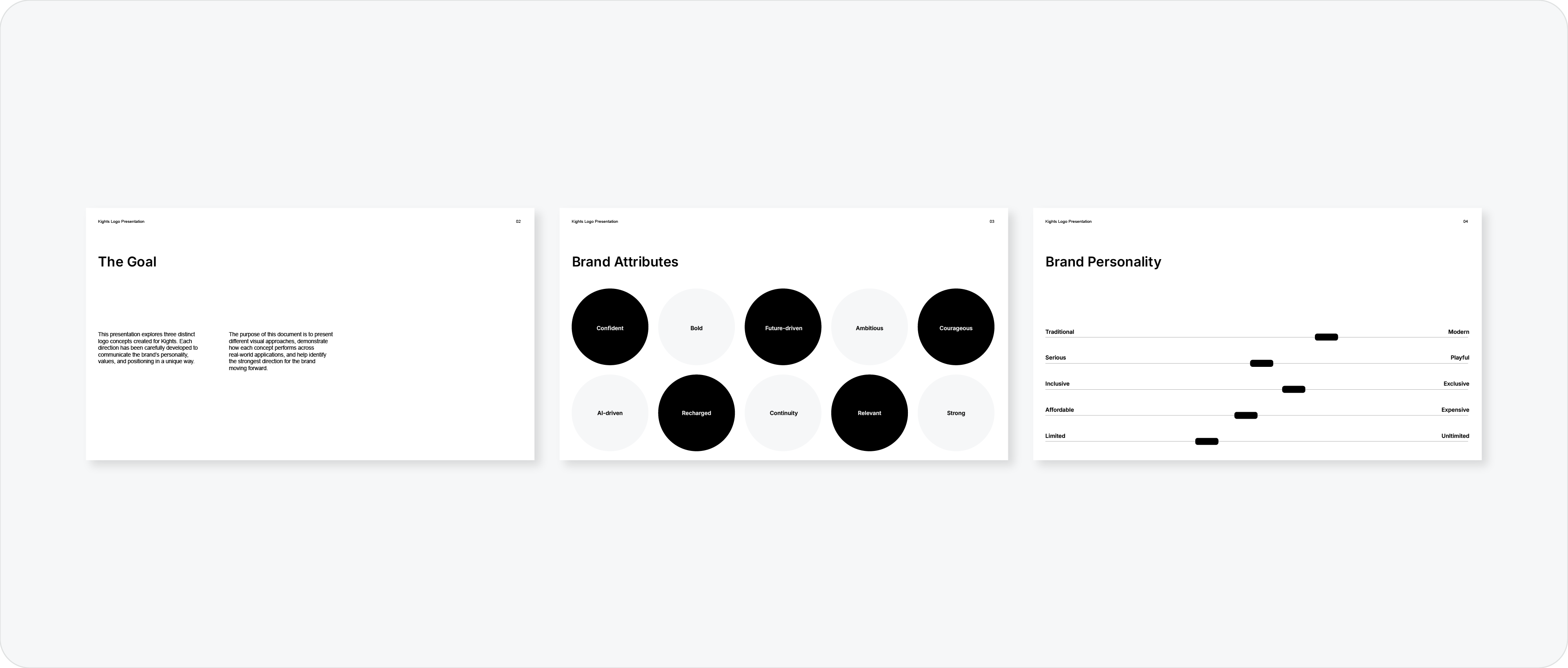
Project goal: a one or two line recap of what this project was commissioned to achieve
Brand attributes: the three to five words that define the brand's character and positioning
Brand personality: how the brand should feel and communicate to its audience
Creative direction / moodboard: the visual references that informed the design approach
Starting here reframes the presentation. The client is no longer evaluating whether they personally like the logo. They are evaluating whether it matches the brief they signed off on. That is a completely different conversation.
2. Visual Identity
This is where the logo is revealed. The Visual Identity section presents the full design system, not just the mark, but every component the brand needs.
Pages to include:
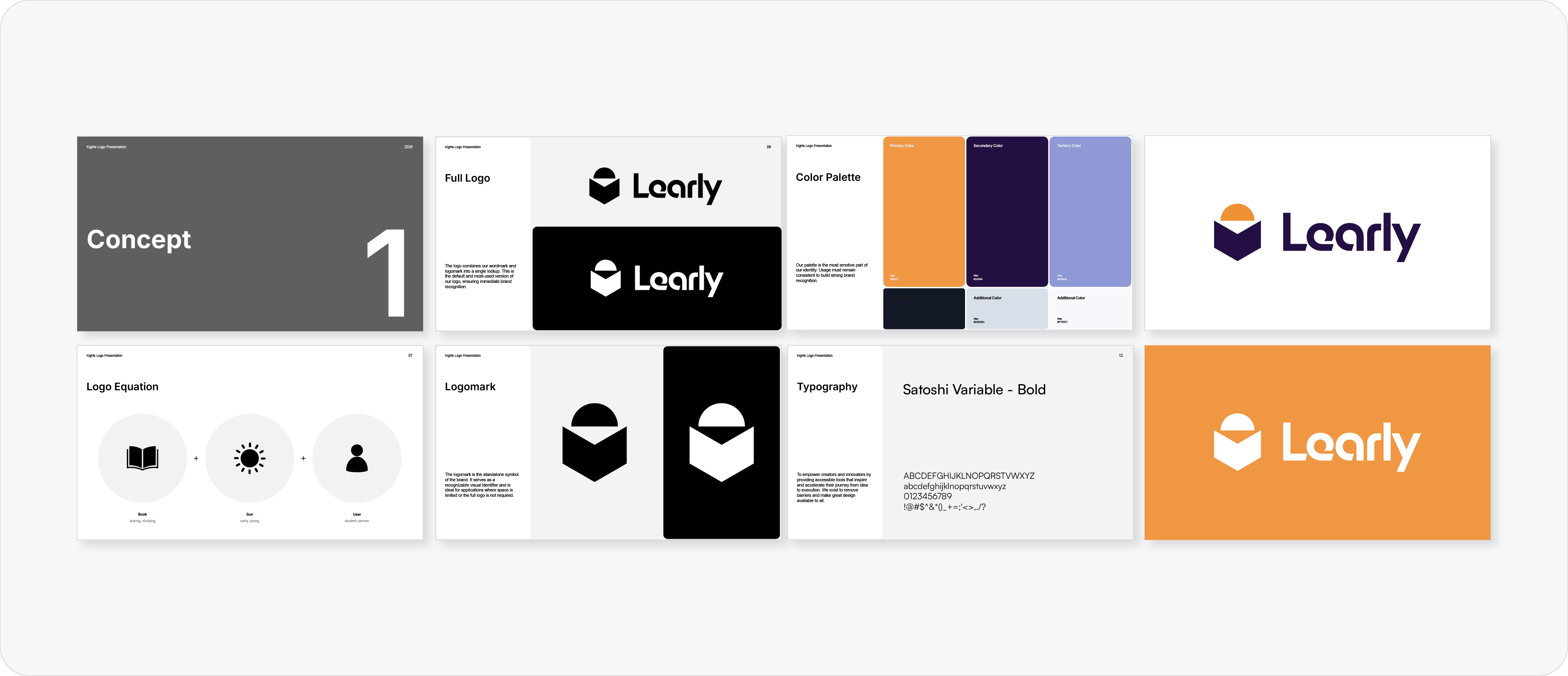
Logo equation / rationale: break down the thinking behind the mark. Show how the concept connects to the brand attributes. Use a formula like: [Core Attribute] + [Visual Concept] = Design Solution
Logo concept reveal: present the primary logo clearly, on a clean background, at a good size
Logo in black and white: showing the mark in monochrome proves it works without colour. It also shows the client that the form is strong enough to stand alone
Logo variations: primary lockup, secondary lockup, logomark, and logotype. Show how the identity adapts across different formats
Typography: the typefaces used across the brand and how they are applied
Colour palette: primary and secondary colours with HEX, RGB, and CMYK values
Do not reveal the logo cold on a blank slide. Build up to it with the rationale first so the client understands what they are looking at before they react to it.
3. Brand Applications
A logo is only as convincing as how it looks in the real world. The Applications section is where the client stops seeing a design and starts seeing their brand.
Pages to include:
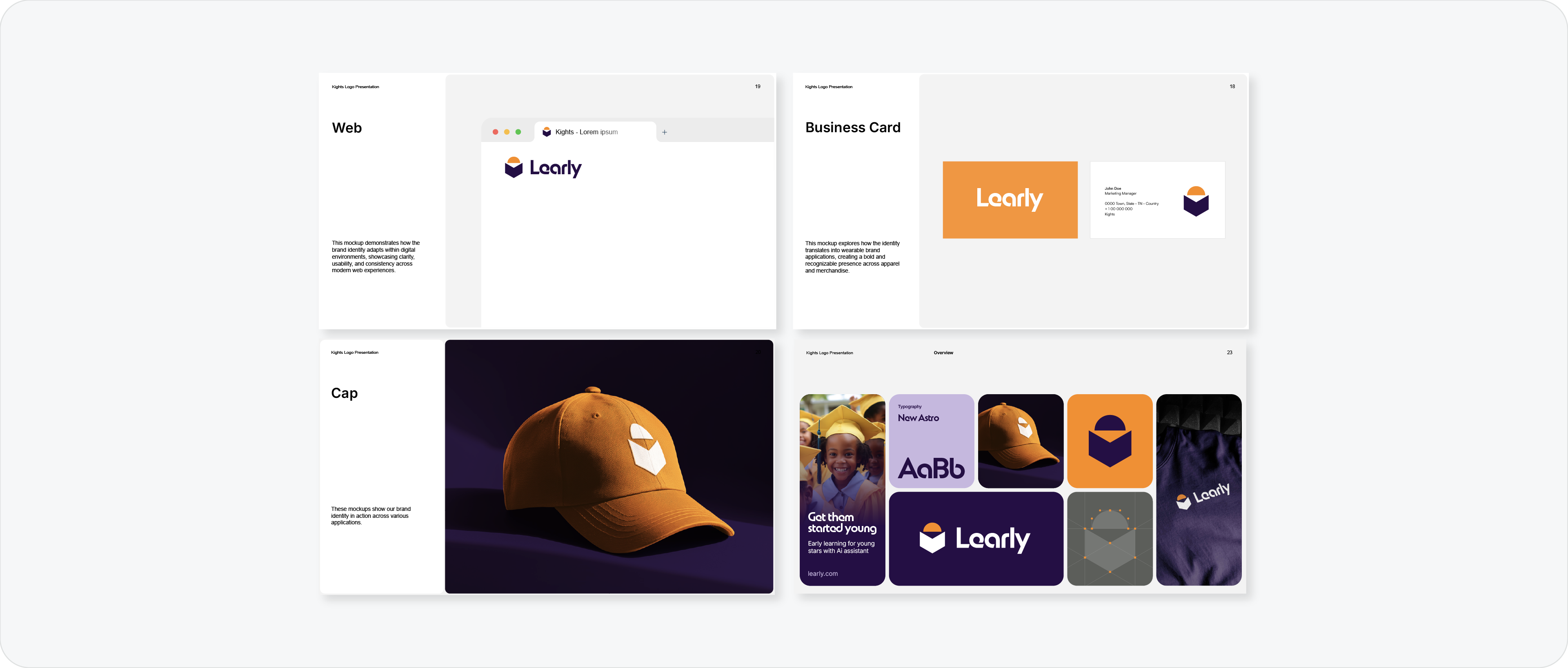
Brand overview / bento grid: a single page showing the logo, colours, typography, and a key mockup together. This gives the client a complete picture of the identity at a glance
Real-world mockups: place the logo on the touchpoints most relevant to the client. Business cards, signage, packaging, a website header, or merchandise depending on the brand
Social media / website examples: show the logo working across profile images, a website header, and any digital formats the client will actually use
Final concept comparison: if you are presenting more than one concept, include a comparison page that puts them side by side for a clear final decision
Choose mockups that reflect the client's actual world. A restaurant brand and a tech startup need completely different contexts.
Discover how using bento grids change how you present logos to clients.
Why this structure works
Most logo presentations fail because they skip the strategic setup and go straight to the reveal. The client has no context, so they react on instinct. Instinct often leads to change requests that have nothing to do with whether the design works.
The three-section structure solves this. Strategic Foundation builds the brief. Visual Identity presents the solution. Applications proves it works. By the time the client reaches the end, they have everything they need to make a confident decision.
A polished presentation is what separates amateur designers from professionals. It shows that you’re not just a designer, but a strategic partner.
To help you get started, I’ve put together a professional Logo Presentation Template that includes all of these key sections. It's designed to save you time and help you present your work with confidence.
Conclusion
A logo presentation needs three things: a foundation that frames the brief, an identity section that reveals the design in full, and an applications section that proves it works in the real world. Get the structure right and the client has everything they need to say yes.